Alert Block
This guide demonstrates how to create a custom Alert block using the Lazy Blocks plugin. The block supports multiple alert types, dismissible functionality, and custom content.
Creating the Alert Block
Step 1: Basic Block Configuration
Configure the essential block settings in the Lazy Blocks builder:
- Set block name, slug, and icon
- Choose appropriate category
- Add description and keywords for better discoverability
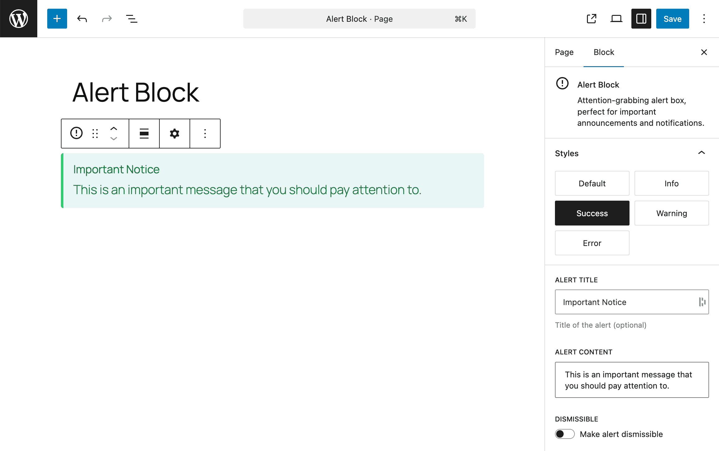
- Configure Style Variations for different alert types (Info, Success, Warning, Error)
Step 2: Adding Controls
Configure the following controls in the block builder:
-
Alert Title (Text control)
- Allows users to input an optional alert title
-
Alert Content (Rich Text control)
- Allows users to input the main alert message with rich text formatting
-
Dismissible (Toggle control)
- Enables/disables close button functionality
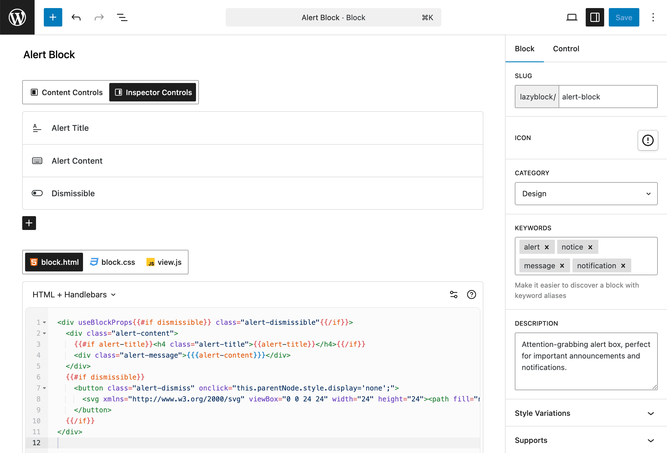
Step 3: Block Code
Add the template code in the Block Code section. This code will automatically work for both editor and frontend rendering. Choose either PHP or Handlebars template:
<div useBlockProps<?php echo $attributes['dismissible'] ? ' class="alert-dismissible"' : ''; ?>>
  <div class="alert-content">
    <?php if ( ! empty( $attributes['alert-title'] ) ) : ?>
      <h4 class="alert-title"><?php echo esc_html( $attributes['alert-title'] ); ?></h4>
    <?php endif; ?>
    <div class="alert-message"><?php echo $attributes['alert-content']; ?></div>
  </div>
  <?php if ( $attributes['dismissible'] ) : ?>
    <button class="alert-dismiss" onclick="this.parentNode.style.display='none';">
      <svg xmlns="http://www.w3.org/2000/svg" viewBox="0 0 24 24" width="24" height="24">
        <path fill="none" d="M0 0h24v24H0z"/>
        <path d="M12 10.586l4.95-4.95 1.414 1.414-4.95 4.95 4.95 4.95-1.414 1.414-4.95-4.95-4.95 4.95-1.414-1.414 4.95-4.95-4.95-4.95L7.05 5.636z"/>
      </svg>
    </button>
  <?php endif; ?>
</div><div useBlockProps{{#if dismissible}} class="alert-dismissible"{{/if}}>
<div class="alert-content">
{{#if alert-title}}<h4 class="alert-title">{{alert-title}}</h4>{{/if}}
<div class="alert-message">{{{alert-content}}}</div>
</div>
{{#if dismissible}}
<button class="alert-dismiss" onclick="this.parentNode.style.display='none';">
<svg xmlns="http://www.w3.org/2000/svg" viewBox="0 0 24 24" width="24" height="24">
<path fill="none" d="M0 0h24v24H0z"/>
<path d="M12 10.586l4.95-4.95 1.414 1.414-4.95 4.95 4.95 4.95-1.414 1.414-4.95-4.95-4.95 4.95-1.414-1.414 4.95-4.95-4.95-4.95L7.05 5.636z"/>
</svg>
</button>
{{/if}}
</div>Step 4: Block Styles
Add the CSS styles in the Block Styles section of the Lazy Blocks builder:
.wp-block-lazyblock-alert-block {
  display: flex;
  padding: 16px;
  border-radius: 4px;
  position: relative;
  background-color: #f3f3f3;
  border-left: 4px solid #b3b3b3;
  color: #4a4a4a;
}
.wp-block-lazyblock-alert-block .alert-content {
  flex-grow: 1;
}
.wp-block-lazyblock-alert-block .alert-title {
  margin-top: 0;
  margin-bottom: 8px;
  font-size: 18px;
}
.wp-block-lazyblock-alert-block .alert-message p:last-child {
  margin-bottom: 0;
}
.wp-block-lazyblock-alert-block .alert-dismiss {
  background: none;
  border: none;
  cursor: pointer;
  padding: 0;
  position: absolute;
  top: 16px;
  right: 16px;
  opacity: 0.7;
}
.wp-block-lazyblock-alert-block .alert-dismiss:hover {
  opacity: 1;
}

/* Alert types */
.wp-block-lazyblock-alert-block.is-style-info {
  background-color: #e8f4fd;
  border-left: 4px solid #3498db;
  color: #0c5d95;
}

.wp-block-lazyblock-alert-block.is-style-success {
  background-color: #e8f8f5;
  border-left: 4px solid #2ecc71;
  color: #1b7943;
}

.wp-block-lazyblock-alert-block.is-style-warning {
  background-color: #fef9e7;
  border-left: 4px solid #f1c40f;
  color: #9a7d0a;
}

.wp-block-lazyblock-alert-block.is-style-error {
  background-color: #fdedec;
  border-left: 4px solid #e74c3c;
  color: #922b21;
}
Style Variations
The Alert block comes with predefined Style Variations that can be applied in the WordPress editor. These are configured in the Basic Block Configuration step:
- Info - Blue styling for informational messages
- Success - Green styling for success messages
- Warning - Yellow styling for warning messages
- Error - Red styling for error messages
Theme Integration
Add this code to your theme's functions.php or plugin file:
add_action( 'lzb/init', function() {
  lazyblocks()->add_block( array(
    'title' => 'Alert Block',
    'icon' => '<svg xmlns="http://www.w3.org/2000/svg" width="24" height="24" viewBox="0 0 24 24"><path d="M11 15h2v2h-2zm0-8h2v6h-2zm.99-5C6.47 2 2 6.48 2 12s4.47 10 9.99 10C17.52 22 22 17.52 22 12S17.52 2 11.99 2zM12 20c-4.42 0-8-3.58-8-8s3.58-8 8-8 8 3.58 8 8-3.58 8-8 8z"></path></svg>',
    'keywords' => array(
      'alert',
      'notice',
      'message',
      'notification',
    ),
    'slug' => 'lazyblock/alert-block',
    'description' => 'Attention-grabbing alert box, perfect for important announcements and notifications.',
    'category' => 'design',
    'category_label' => 'design',
    'supports' => array(
      'customClassName' => true,
      'anchor' => false,
      'html' => false,
      'multiple' => true,
      'inserter' => true,
      'reusable' => true,
      'lock' => true,
      'align' => array(
        'wide',
        'full',
      ),
    ),
    'controls' => array(
      'control_d4aad34f6e' => array(
        'type' => 'text',
        'name' => 'alert-title',
        'default' => 'Important Notice',
        'label' => 'Alert Title',
        'help' => 'Title of the alert (optional)',
        'placement' => 'inspector',
        'translate' => 'true',
      ),
      'control_3ebbb94850' => array(
        'type' => 'rich_text',
        'name' => 'alert-content',
        'default' => 'This is an important message that you should pay attention to.',
        'label' => 'Alert Content',
        'placement' => 'inspector',
        'translate' => 'true',
      ),
      'control_daeade4589' => array(
        'type' => 'toggle',
        'name' => 'dismissible',
        'default' => 'false',
        'label' => 'Dismissible',
        'placement' => 'inspector',
        'checked' => 'false',
        'alongside_text' => 'Make alert dismissible',
      ),
    ),
    'code' => array(
      'output_method' => 'html',
      'editor_html' => '',
      'editor_callback' => '',
      'frontend_html' => '
        /* INSERT BLOCK CODE HERE */
      ',
      'frontend_callback' => '',
      'show_preview' => 'always',
      'single_output' => true,
    ),
    'style' => array(
      'block' => '
        /* INSERT BLOCK STYLES HERE */
      ',
      'editor' => '',
    ),
    'script' => array(
      'view' => '',
    ),
    'styles' => array(
      array(
          'name' => 'info',
          'label' => 'Info',
      ),
      array(
          'name' => 'success',
          'label' => 'Success',
      ),
      array(
          'name' => 'warning',
          'label' => 'Warning',
      ),
      array(
          'name' => 'error',
          'label' => 'Error',
      ),
    ),
    'condition' => array(),
  ) );
} );
This implementation provides a fully functional Alert block that integrates seamlessly with the WordPress block editor with custom styling and multiple alert variations.