Controls
Controls let users customize blocks by managing block attributes in the block editor. Each control handles different types of data - from simple text inputs to complex file uploaders and repeaters. When the block renders, you can access these values to output them in your block.
Adding Controls
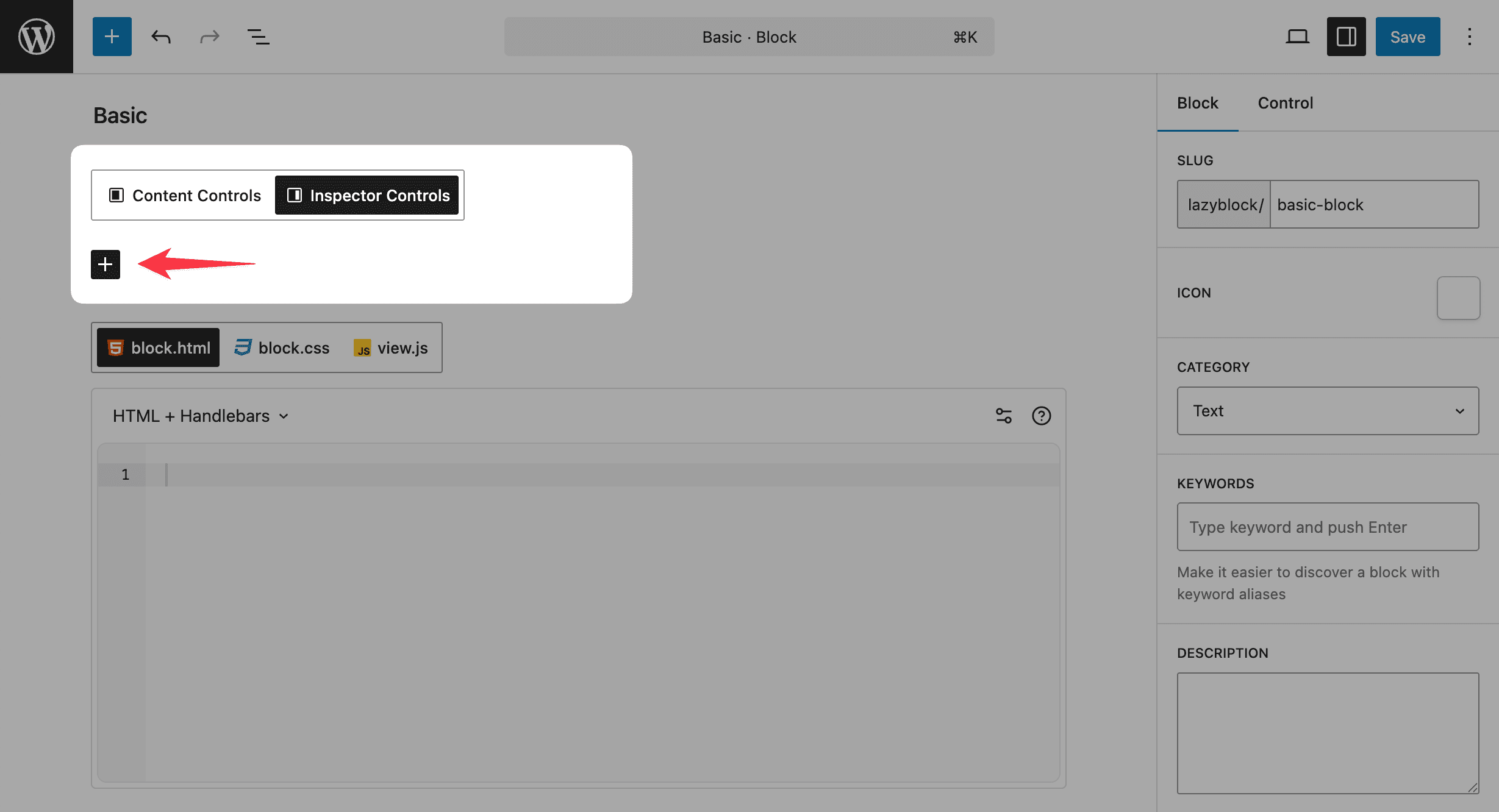
Add controls to your block using the "Add Control" button in the block builder. You can add multiple controls to manage different aspects of your block.
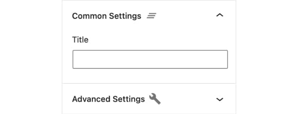
Control Settings
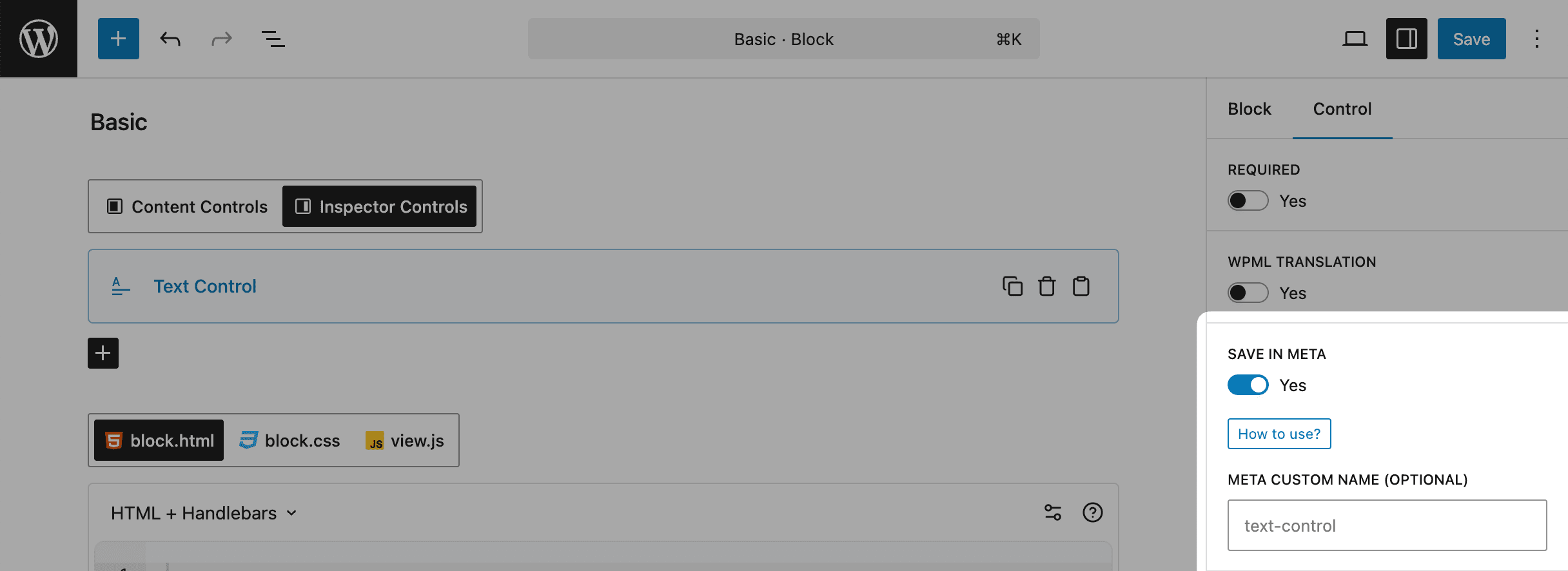
Each control has a set of common settings that determine how it works and displays:
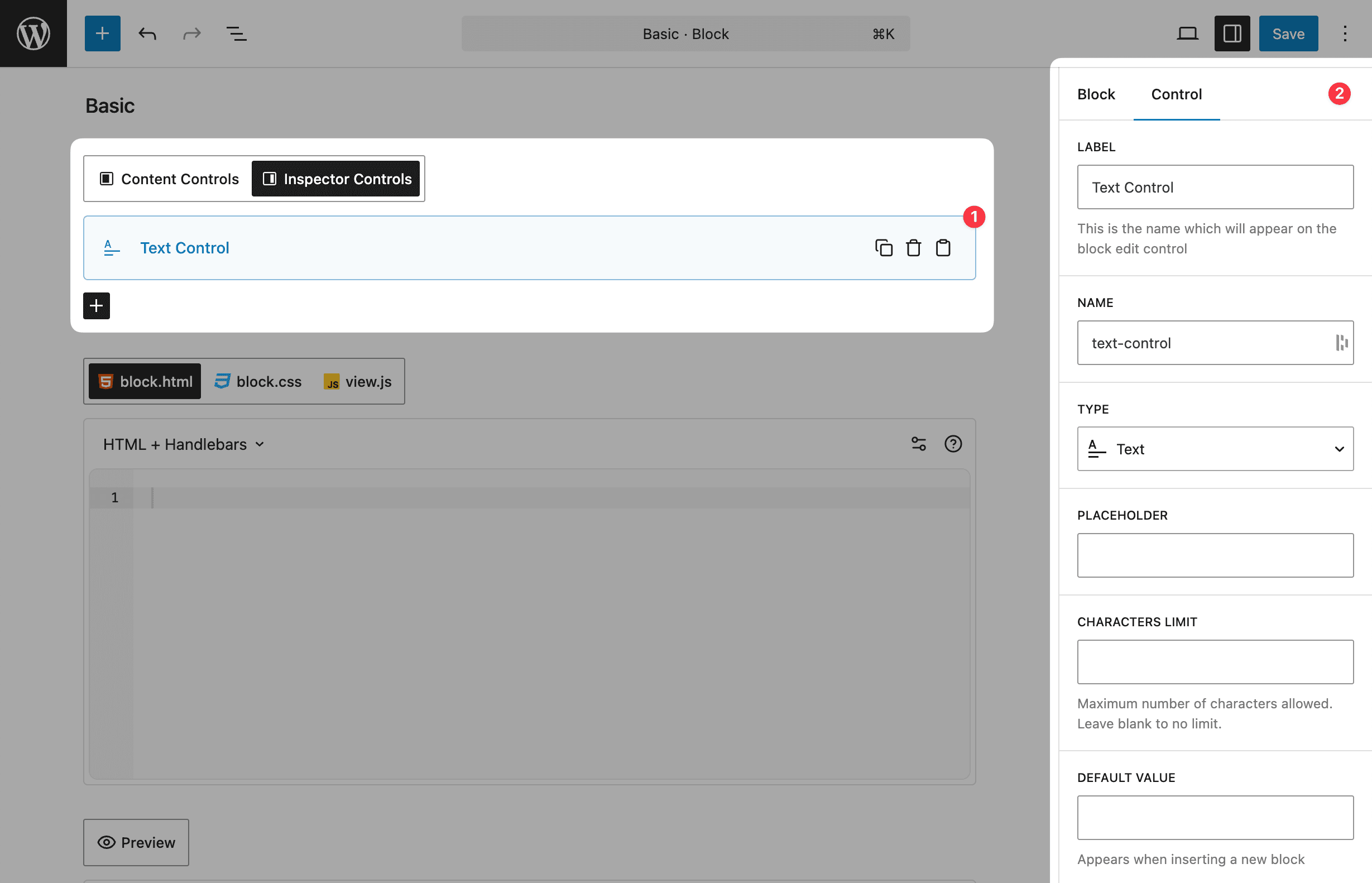
Basic Settings
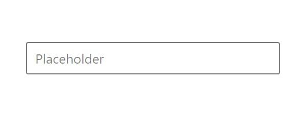
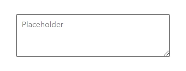
- Label - The name shown in the block editor
- Name - Unique identifier for accessing the control's value in code
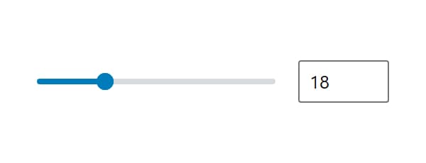
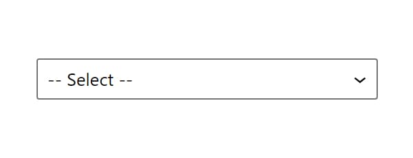
- Type - The kind of control (Text, Select, Image, etc.)
- Default value - Initial value when adding a new block
Display Settings
- Placement - Where the control appears (Content or Inspector)
- Width - Control width in Content area (25%, 50%, 75%, 100%)
- Help text - Additional information shown below the control
Advanced Settings
- Required - Prevent publishing if the control is empty
- Hide if block is not selected - Only show when block is active
- WPML Translation - Makes Text controls available for translation in WPML plugin. Learn more here
- Save in Meta - Store value in custom meta field
- Conditional Logic - Show/hide based on other controls
Control Placement
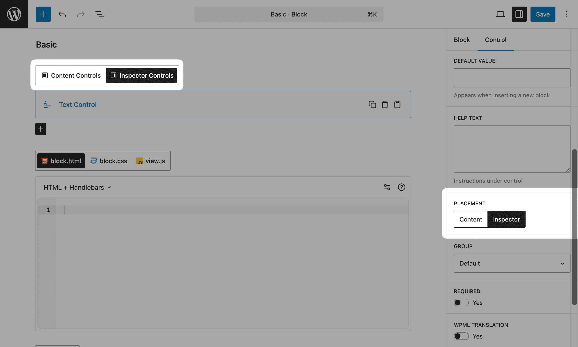
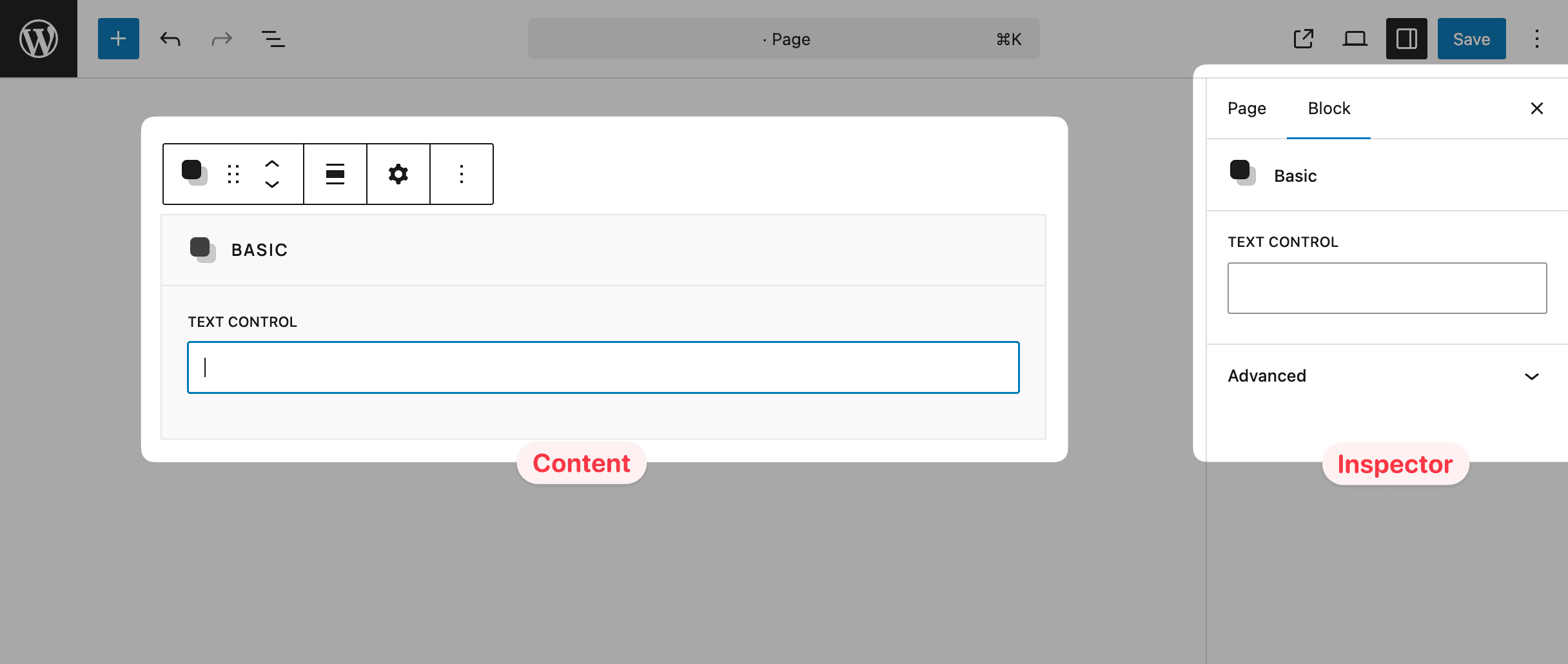
Controls can be placed in 2 locations: Inspector and Content (inside block body). However, we recommend using the Inspector for your controls to follow WordPress best practices. Native WordPress blocks use the Inspector panel for all controls, while the Content area is reserved for rendering the actual block output.
When you add controls to the Content area, Lazy Blocks will automatically add a frame border and title to your block to distinguish it from regular content. This visual change helps users understand that the block contains editable controls.
Inspector Groups
When placing controls in the Inspector panel, you can organize them into specific groups:
- Default - Standard inspector controls group
- Styles - Group for styling-related controls
- Advanced - Group for advanced block settings
This grouping helps organize your block controls in a way that matches WordPress core blocks structure, making it more intuitive for users familiar with the block editor.
Custom Meta Field
Each control has the possibility to save its value in the custom fields, so this value will be available in the post meta data and developers may get this value. For example:
<p><?php echo get_lzb_meta( 'control_meta_name' ); ?></p>You should add a unique custom field name, as 3rd-party plugins/themes may use the same name and it will be conflicted. For example, if you want to use this block in your theme "My Super Theme", we recommend adding slug name – mst_control_meta_name.
Reserved Control Names
There are reserved control names that you shouldn't use:
| Name | Description |
|---|---|
lazyblock | internal block data used by Lazy Blocks plugin |
className | block custom classname |
align | block align |
anchor | block custom ID |
blockId | block unique ID, generates automatically |
blockUniqueClass | block unique class, generates automatically |
All Controls
Basic
Content


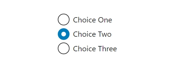
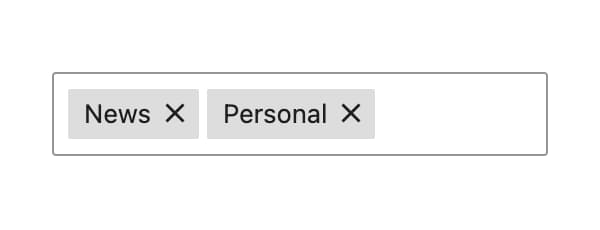
Choice


Advanced
Layout